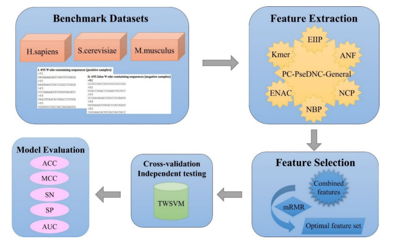
Biological sequence analysis is an important basic research work in the field of bioinformatics. With the explosive growth of data, machine learning methods play an increasingly important role in biological sequence analysis. By constructing a classifier for prediction, the input sequence feature vector is predicted and evaluated, and the knowledge of gene structure, function and evolution is obtained from a large amount of sequence information, which lays a foundation for researchers to carry out in-depth research. At present, many machine learning methods have been applied to biological sequence analysis such as RNA gene recognition and protein secondary structure prediction. As a biological sequence, RNA plays an important biological role in the encoding, decoding, regulation and expression of genes. The analysis of RNA data is currently carried out from the aspects of structure and function, including secondary structure prediction, non-coding RNA identification and functional site prediction. Pseudouridine (У) is the most widespread and rich RNA modification and has been discovered in a variety of RNAs. It is highly essential for the study of related functional mechanisms and disease diagnosis to accurately identify У sites in RNA sequences. At present, several computational approaches have been suggested as an alternative to experimental methods to detect У sites, but there is still potential for improvement in their performance. In this study, we present a model based on twin support vector machine (TWSVM) for У site identification. The model combines a variety of feature representation techniques and uses the max-relevance and min-redundancy methods to obtain the optimum feature subset for training. The independent testing accuracy is improved by 3.4% in comparison to current advanced У site predictors. The outcomes demonstrate that our model has better generalization performance and improves the accuracy of У site identification. iPseU-TWSVM can be a helpful tool to identify У sites.
Citation: Mingshuai Chen, Xin Zhang, Ying Ju, Qing Liu, Yijie Ding. iPseU-TWSVM: Identification of RNA pseudouridine sites based on TWSVM[J]. Mathematical Biosciences and Engineering, 2022, 19(12): 13829-13850. doi: 10.3934/mbe.2022644
Biological sequence analysis is an important basic research work in the field of bioinformatics. With the explosive growth of data, machine learning methods play an increasingly important role in biological sequence analysis. By constructing a classifier for prediction, the input sequence feature vector is predicted and evaluated, and the knowledge of gene structure, function and evolution is obtained from a large amount of sequence information, which lays a foundation for researchers to carry out in-depth research. At present, many machine learning methods have been applied to biological sequence analysis such as RNA gene recognition and protein secondary structure prediction. As a biological sequence, RNA plays an important biological role in the encoding, decoding, regulation and expression of genes. The analysis of RNA data is currently carried out from the aspects of structure and function, including secondary structure prediction, non-coding RNA identification and functional site prediction. Pseudouridine (У) is the most widespread and rich RNA modification and has been discovered in a variety of RNAs. It is highly essential for the study of related functional mechanisms and disease diagnosis to accurately identify У sites in RNA sequences. At present, several computational approaches have been suggested as an alternative to experimental methods to detect У sites, but there is still potential for improvement in their performance. In this study, we present a model based on twin support vector machine (TWSVM) for У site identification. The model combines a variety of feature representation techniques and uses the max-relevance and min-redundancy methods to obtain the optimum feature subset for training. The independent testing accuracy is improved by 3.4% in comparison to current advanced У site predictors. The outcomes demonstrate that our model has better generalization performance and improves the accuracy of У site identification. iPseU-TWSVM can be a helpful tool to identify У sites.

| [1] |
P. Boccaletto, M. A. Machnicka, E. Purta, P. Piatkowski, B. Baginski, T. K. Wirecki, et al., MODOMICS: A database of RNA modification pathways. 2017 update, Nucleic Acids Res., 46 (2018), D303-D307. https://doi.org/10.1093/nar/gkx1030 doi: 10.1093/nar/gkx1030

|
| [2] |
J. Song, C. Yi, Chemical modifications to RNA: A new layer of gene expression regulation, ACS Chem. Biol., 12 (2017), 316-325. https://doi.org/10.1021/acschembio.6b00960 doi: 10.1021/acschembio.6b00960
|
| [3] |
F. F. Davis, F. W. Allen, Ribonucleic acids from yeast which contain a fifth nucleotide, J. Biol. Chem., 227 (1957), 907-915. https://doi.org/10.1016/s0021-9258(18)70770-9 doi: 10.1016/s0021-9258(18)70770-9
|
| [4] |
W. E. Cohn, Pseudouridine, a carbon-carbon linked ribonucleoside in ribonucleic acids: Isolation, structure, and chemical characteristics, J. Biol. Chem., 235 (1960), 1488-1498. https://doi.org/10.1002/jbmte.390020410 doi: 10.1002/jbmte.390020410
|
| [5] |
T. Fujiwara, H. Harigae, Molecular pathophysiology and genetic mutations in congenital sideroblastic anemia, Free Radical Biol. Med., 133 (2019), 179-185. https://doi.org/10.1016/j.freeradbiomed.2018.08.008 doi: 10.1016/j.freeradbiomed.2018.08.008
|
| [6] |
N. Guzzi, M. Ciesla, P. C. T. Ngoc, S. Lang, S. Arora, M. Dimitriou, et al., Pseudouridylation of tRNA-derived fragments steers translational control in stem cells, Cell, 173 (2018), 1204-1216. https://doi.org/10.1016/j.cell.2018.03.008 doi: 10.1016/j.cell.2018.03.008
|
| [7] |
J. Karijolich, Y. T. Yu, Converting nonsense codons into sense codons by targeted pseudouridylation, Nature, 474 (2011), 395-398. https://doi.org/10.1038/nature10165 doi: 10.1038/nature10165
|
| [8] |
R. W. Holley, G. A. Everett, J. T. Madison, A. Zamir, Nucleotide sequences in the yeast alanine transfer ribonucleic acid, J. Biol. Chem., 240 (1965), 2122-2128. https://doi.org/10.1016/s0021-9258(18)97435-1 doi: 10.1016/s0021-9258(18)97435-1
|
| [9] |
C. Y. Gradeen, D. M.Billay, S. C. Chan, Analysis of bumetanide in human urine by high-performance liquid chromatography with fluorescence detection and gas chromatographyl/mass spectrometry, J. Anal. Toxicol., 14 (1990), 123-126. https://doi.org/10.1093/jat/14.2.123 doi: 10.1093/jat/14.2.123
|
| [10] |
A. Basak, C. C. Query, A pseudouridine residue in the spliceosome core is part of the filamentous growth program in yeast, Cell Rep., 8 (2014), 966-973. https://doi.org/10.1016/j.celrep.2014.07.004 doi: 10.1016/j.celrep.2014.07.004
|
| [11] |
T. M. Carlile, M. F. Rojas-Duran, B. Zinshteyn, H. Shin, K. M. Bartoli, W. V. Gilbert, Pseudouridine profiling reveals regulated mRNA pseudouridylation in yeast and human cells, Nature, 515 (2014), 143-146. https://doi.org/10.1038/nature13802 doi: 10.1038/nature13802
|
| [12] |
S. Schwartz, D. A. Bernstein, M. R. Mumbach, M. Jovanovic, R. H. Herbst, B. X. Leon-Ricardo, et al., Transcriptome-wide mapping reveals widespread dynamic-regulated pseudouridylation of ncRNA and mRNA, Cell, 159 (2014), 148-162. https://doi.org/10.1016/j.cell.2014.08.028 doi: 10.1016/j.cell.2014.08.028
|
| [13] |
X. Li, P. Zhu, S. Ma, J. Song, J. Bai, F. Sun, et al., Chemical pulldown reveals dynamic pseudouridylation of the mammalian transcriptome, Nat. Chem. Biol., 11 (2015), 592-597. https://doi.org/10.1038/nchembio.1836 doi: 10.1038/nchembio.1836
|
| [14] |
B. Panwar, G. P. Raghava, Prediction of uridine modifications in tRNA sequences, BMC Bioinf., 15 (2014), 326. https://doi.org/10.1186/1471-2105-15-326 doi: 10.1186/1471-2105-15-326
|
| [15] |
Y. H. Li, G. Zhang, Q. Cui, PPUS: A web server to predict PUS-specific pseudouridine sites, Bioinformatics, 31 (2015), 3362-3364. https://doi.org/10.1093/bioinformatics/btv366 doi: 10.1093/bioinformatics/btv366
|
| [16] |
W. Chen, H. Tang, J. Ye, H. Lin, K. C. Chou, iRNA-PseU: Identifying RNA pseudouridine sites, Mol. Ther. Nucleic Acids, 5 (2016), e332. https://doi.org/10.1038/mtna.2016.37 doi: 10.1038/mtna.2016.37
|
| [17] |
J. He, T. Fang, Z. Zhang, B. Huang, X. Zhu, Y. Xiong, PseUI: Pseudouridine sites identification based on RNA sequence information, BMC Bioinf., 19 (2018), 306. https://doi.org/10.1186/s12859-018-2321-0 doi: 10.1186/s12859-018-2321-0
|
| [18] |
M. Tahir, H. Tayara, K. T. Chong, iPseU-CNN: Identifying RNA pseudouridine sites using convolutional neural networks, Mol. Ther. Nucleic Acids, 16 (2019), 463-470. https://doi.org/10.1016/j.omtn.2019.03.010 doi: 10.1016/j.omtn.2019.03.010
|
| [19] |
K. Liu, W. Chen, H. Lin, XG-PseU: An eXtreme Gradient Boosting based method for identifying pseudouridine sites, Mol. Genet. Genomics, 295 (2020), 13-21. https://doi.org/10.1007/s00438-019-01600-9 doi: 10.1007/s00438-019-01600-9
|
| [20] |
Z. Lv, J. Zhang, H. Ding, Q. Zou, RF-PseU: A random forest predictor for RNA pseudouridine sites, Front. Bioeng. Biotechnol., 8 (2020), 134. https://doi.org/10.3389/fbioe.2020.00134 doi: 10.3389/fbioe.2020.00134
|
| [21] |
S. M. Khan, F. He, D. Wang, Y. Chen, D. Xu, Mu-pseudeep: A deep learning method for prediction of pseudouridine sites, Comput. Struct. Biotechnol. J., 18 (2020), 1877-1883. https://doi.org/10.1016/j.csbj.2020.07.010 doi: 10.1016/j.csbj.2020.07.010
|
| [22] |
F. Li, X. Guo, P. Jin, J. Chen, D. Xiang, J. Song, Porpoise: A new approach for accurate prediction of RNA pseudouridine sites, Briefings Bioinf., 22 (2021), bbab245. https://doi.org/10.1093/bib/bbab245 doi: 10.1093/bib/bbab245
|
| [23] |
Y. Q. Qian, H. Meng, W. Z. Lu, Z. J. Liao, Y. J. Ding, H. J. Wu, Identification of DNA-binding proteins via hypergraph based laplacian support vector machine, Curr. Bioinf., 17 (2022), 108-117. https://doi.org/10.2174/1574893616666210806091922 doi: 10.2174/1574893616666210806091922
|
| [24] |
S. Naseer, W. Hussain, Y. D. Khan, N. Rasool, NPalmitoylDeep-PseAAC: A predictor of N-palmitoylation sites in proteins using deep representations of proteins and PseAAC via modified 5-Steps rule, Curr. Bioinf., 16 (2021), 294-305. https://doi.org/10.2174/1574893615999200605142828 doi: 10.2174/1574893615999200605142828
|
| [25] |
S. W. Sun, L. Xu, Q. Zou, G. H. Wang, BP4RNAseq: A babysitter package for retrospective and newly generated RNA-seq data analyses using both alignment-based and alignment-free quantification methods, Bioinformatics, 37 (2021), 1319-1321. https://doi.org/10.1093/bioinformatics/btaa832 doi: 10.1093/bioinformatics/btaa832
|
| [26] |
L. Zhang, Z. Huang, L. Kong, CSBPI_Site: Multi-information sources of features to RNA binding sites prediction, Curr. Bioinf., 16 (2021), 691-699. https://doi.org/10.2174/1574893615666210108093950 doi: 10.2174/1574893615666210108093950
|
| [27] |
Z. Zhang, F. Cui, W. Su, L. Dou, A. Xu, C. Cao, Q. Zou, webSCST: An interactive web application for single-cell RNA-sequencing data and spatial transcriptomic data integration, Bioinformatics, 38 (2022), 3488-3489. https://doi.org/ 10.1093/bioinformatics/btac350 doi: 10.1093/bioinformatics/btac350
|
| [28] |
X. Wang, S. Wang, H. Fu, X. Ruan, X. Tang, DeepFusion-RBP: Using Deep Learning to Fuse Multiple Features to Identify RNA-binding Protein Sequences, Curr. Bioinf., 16 (2021), 1089-1100. https://doi.org/ 10.2174/1574893616666210618145121 doi: 10.2174/1574893616666210618145121
|
| [29] |
W. Chen, H. Ding, X. Zhou, H. Lin, K. C. Chou, iRNA(m6A)-PseDNC: Identifying N(6)-methyladenosine sites using pseudo dinucleotide composition, Anal. Biochem., 561 (2018), 59-65. https://doi.org/10.1016/j.ab.2018.09.002 doi: 10.1016/j.ab.2018.09.002
|
| [30] |
L. Wei, M. Liao, Y. Gao, R. Ji, Z. He, Q. Zou, Improved and promising identification of human microRNAs by incorporating a high-quality negative set, IEEE/ACM Trans. Comput. Biol. Bioinf., 11 (2014), 192-201. https://doi.org/10.1109/TCBB.2013.146 doi: 10.1109/TCBB.2013.146
|
| [31] |
B. Liu, X. Gao, H. Zhang, BioSeq-Analysis2.0: an updated platform for analyzing DNA, RNA and protein sequences at sequence level and residue level based on machine learning approaches, Nucleic Acids Res., 47 (2019), e127. https://doi.org/10.1093/nar/gkz740 doi: 10.1093/nar/gkz740
|
| [32] |
W. Chen, X. Zhang, J. Brooker, H. Lin, L. Zhang, K. C. Chou, PseKNC-General: A cross-platform package for generating various modes of pseudo nucleotide compositions, Bioinformatics, 31 (2015), 119-120. https://doi.org/10.1093/bioinformatics/btu602 doi: 10.1093/bioinformatics/btu602
|
| [33] |
H. Yang, H. Lv, H. Ding, W. Chen, H. Lin, iRNA-2OM: A sequence-based predictor for identifying 2'-O-Methylation sites in Homo sapiens, J. Comput. Biol., 25 (2018), 1266-1277.https://doi.org/10.1089/cmb.2018.0004 doi: 10.1089/cmb.2018.0004
|
| [34] |
B. Liu, BioSeq-Analysis: A platform for DNA, RNA and protein sequence analysis based on machine learning approaches, Briefings Bioinf., 20 (2019), 1280-1294. https://doi.org/10.1093/bib/bbx165 doi: 10.1093/bib/bbx165
|
| [35] |
Y. Hu, T. Zhao, N. Zhang, Y. Zhang, L. Cheng, A review of recent advances and research on drug target identification methods, Curr. Drug Metab., 20 (2019), 209-216. https://doi.org/10.2174/1389200219666180925091851 doi: 10.2174/1389200219666180925091851
|
| [36] | A. S. Nair, S. P. Sreenadhan, A coding measure scheme employing electron-ion interaction pseudopotential (EⅡP), Bioinformation, 1 (2006), 197-202. |
| [37] |
H. Peng, F. Long, C. Ding, Feature selection based on mutual information: Criteria of max-dependency, max-relevance, and min-redundancy, IEEE Trans. Pattern Anal. Mach. Intell., 27 (2005), 1226-1238. https://doi.org/10.1109/TPAMI.2005.159 doi: 10.1109/TPAMI.2005.159
|
| [38] |
Y. Tian, Z. Qi, Review on: Twin support vector machines, Ann. Data Sci., 1 (2014), 253-277. https://doi.org/10.1007/s40745-014-0018-4 doi: 10.1007/s40745-014-0018-4
|
| [39] |
L. Cheng, J. Sun, W. Xu, L. Dong, Y. Hu, M. Zhou, OAHG: An integrated resource for annotating human genes with multi-level ontologies, Sci. Rep., 6 (2016), 1-9. https://doi.org/10.1038/srep34820 doi: 10.1038/srep34820
|
| [40] |
L. Y. Wei, S. X. Wan, J. S. Guo, K. K. L. Wong, A novel hierarchical selective ensemble classifier with bioinformatics application, Artif. Intell. Med., 83 (2017), 82-90. https://doi.org/10.1016/j.artmed.2017.02.005 doi: 10.1016/j.artmed.2017.02.005
|
| [41] |
B. Liu, C. C. Li, K. Yan, DeepSVM-fold: protein fold recognition by combining support vector machines and pairwise sequence similarity scores generated by deep learning networks, Briefings Bioinf., 21 (2020), 1733-1741. https://doi.org/10.1093/bib/bbz098 doi: 10.1093/bib/bbz098
|
| [42] |
D. Mrozek, P. Gosk, B. Małysiak-Mrozek, Scaling Ab initio predictions of 3D protein structures in microsoft azure cloud, J. Grid Comput., 13 (2015), 561-585. https://doi.org/10.1007/s10723-015-9353-8 doi: 10.1007/s10723-015-9353-8
|
| [43] |
R. Cao, J. Cheng, Protein single-model quality assessment by feature-based probability density functions, Sci. Rep., 6 (2016), 23990. https://doi.org/10.1038/srep23990 doi: 10.1038/srep23990
|
| [44] |
W. Chen, H. Yang, P. Feng, H. Ding, H. Lin, iDNA4mC: Identifying DNA N-4-methylcytosine sites based on nucleotide chemical properties, Bioinformatics, 33 (2017), 3518-3523. https://doi.org/ 10.1093/bioinformatics/btx479 doi: 10.1093/bioinformatics/btx479
|
| [45] |
W. Chen, H. Lv, F. Nie, H. Lin, i6mA-Pred: identifying DNA N6-methyladenine sites in the rice genome, Bioinformatics, 35 (2019), 2796-2800. https://doi.org/10.1093/bioinformatics/btz015 doi: 10.1093/bioinformatics/btz015
|
| [46] |
G. Pan, J. Tang, F. Guo, Analysis of co-associated transcription factors via ordered adjacency differences on motif distribution, Sci. Rep., 7 (2017), 43597. https://doi.org/10.1038/srep43597 doi: 10.1038/srep43597
|
| [47] |
W. He, C. Jia, Q. Zou, 4mCPred: machine learning methods for DNA N4-methylcytosine sites prediction, Bioinformatics, 35 (2019), 593-601. https://doi.org/10.1093/bioinformatics/bty668 doi: 10.1093/bioinformatics/bty668
|
| [48] |
L. Jiang, Y. Ding, J. Tang, F. Guo, MDA-SKF: Similarity kernel fusion for accurately discovering miRNA-Disease association, Front. Genet., 9 (2018), 618. https://doi.org/10.3389/fgene.2018.00618 doi: 10.3389/fgene.2018.00618
|
| [49] |
Y. Xiong, Q. Wang, J. Yang, X. Zhu, D. Q. Wei, PredT4SE-Stack: Prediction of bacterial type Ⅳ secreted effectors from protein sequences using a stacked ensemble method, Front. Microbiol., 9 (2018), 2571. https://doi.org/10.3389/fmicb.2018.02571 doi: 10.3389/fmicb.2018.02571
|
| [50] |
L. Yu, J. Zhao, L. Gao, Predicting potential drugs for breast cancer based on miRNA and tissue specificity, Int. J. Biol. Sci., 14 (2018), 971-982. https://doi.org/10.7150/ijbs.23350 doi: 10.7150/ijbs.23350
|
| [51] |
M. Zhang, Y. Xu, L. Li, Z. Liu, X. Yang, D. J. Yu, Accurate RNA 5-methylcytosine site prediction based on heuristic physical-chemical properties reduction and classifier ensemble, Anal. Biochem., 550 (2018), 41-48. https://doi.org/10.1016/j.ab.2018.03.027 doi: 10.1016/j.ab.2018.03.027
|
| [52] |
Y. Ding, J. Tang, F. Guo, Identification of drug-side effect association via multiple information integration with centered kernel alignment, Neurocomputing, 325 (2019), 211-224. https://doi.org/10.1016/j.neucom.2018.10.028 doi: 10.1016/j.neucom.2018.10.028
|
| [53] |
B. Manavalan, S. Basith, T. H. Shin, L. Wei, G. Lee, Meta-4mCpred: A sequence-based meta-predictor for accurate DNA 4mC site prediction using effective feature representation, Mol. Ther. Nucleic Acids, 16 (2019), 733-744. https://doi.org/10.1016/j.omtn.2019.04.019 doi: 10.1016/j.omtn.2019.04.019
|
| [54] |
P. Feng, H. Yang, H. Ding, H. Lin, W. Chen, K. C. Chou, iDNA6mA-PseKNC: Identifying DNA N(6)-methyladenosine sites by incorporating nucleotide physicochemical properties into PseKNC, Genomics, 111 (2019), 96-102. https://doi.org/10.1016/j.ygeno.2018.01.005 doi: 10.1016/j.ygeno.2018.01.005
|
| [55] |
L. Kong, L. Zhang, i6mA-DNCP: Computational identification of DNA N(6)-methyladenine sites in the rice genome using optimized dinucleotide-based features, Genes, 10 (2019), 828. https://doi.org/10.3390/genes10100828 doi: 10.3390/genes10100828
|
| [56] |
C. C. Li, B. Liu, MotifCNN-fold: protein fold recognition based on fold-specific features extracted by motif-based convolutional neural networks, Briefings Bioinf., 21 (2020), 2133-2141. https://doi.org/10.1093/bib/bbz133 doi: 10.1093/bib/bbz133
|
| [57] |
X. Shan, X. Wang, C. D. Li, Y. Chu, Y. Zhang, Y. Xiong, et al., Prediction of CYP450 enzyme-substrate selectivity based on the network-based label space division method, J. Chem. Inf. Model., 59 (2019), 4577-4586. https://doi.org/10.1021/acs.jcim.9b00749 doi: 10.1021/acs.jcim.9b00749
|
| [58] |
X. Wang, X. Zhu, M. Ye, Y. Wang, C. D. Li, Y. Xiong, et al., STS-NLSP: A network-based label space partition method for predicting the specificity of membrane transporter substrates using a hybrid feature of structural and semantic similarity, Front. Bioeng. Biotechnol., 7 (2019), 306. https://doi.org/10.3389/fbioe.2019.00306 doi: 10.3389/fbioe.2019.00306
|
| [59] |
L. Wei, S. Luan, L. A. E. Nagai, R. Su, Q. Zou, Exploring sequence-based features for the improved prediction of DNA N4-methylcytosine sites in multiple species, Bioinformatics, 35 (2019), 1326-1333. https://doi.org/10.1093/bioinformatics/bty824 doi: 10.1093/bioinformatics/bty824
|
| [60] |
L. Wei, R. Su, S. Luan, Z. Liao, B. Manavalan, Q. Zou, et al., Iterative feature representations improve N4-methylcytosine site prediction, Bioinformatics, 35 (2019), 4930-4937. https://doi.org/10.1093/bioinformatics/btz408 doi: 10.1093/bioinformatics/btz408
|
| [61] |
L. Xu, G. Liang, C. Liao, G. D. Chen, C. C. Chang, k-Skip-n-Gram-RF: A random forest based method for Alzheimer's disease protein identification, Front. Genet., 10 (2019), 33. https://doi.org/10.3389/fgene.2019.00033 doi: 10.3389/fgene.2019.00033
|
| [62] |
L. H. Roland, C. T. Wannige, A deep learning model for predicting DNA N6-methyladenine (6mA) sites in eukaryotes, IEEE Access, 8 (2020), 175535-175545. https://doi.org/10.1109/access.2020.3025990 doi: 10.1109/access.2020.3025990
|
| [63] |
Z. Chen, P. Zhao, F. Li, T. T. Marquez-Lago, A. Leier, J. Revote, et al., iLearn: An integrated platform and meta-learner for feature engineering, machine-learning analysis and modeling of DNA, RNA and protein sequence data, Briefings Bioinf., 21 (2020), 1047-1057. https://doi.org/10.1093/bib/bbz041 doi: 10.1093/bib/bbz041
|
| [64] | G. Ke, Q. Meng, T. Finley, T. Wang, W. Chen, W. Ma, et al., LightGBM: A highly efficient gradient boosting decision tree, in Advances in Neural Information Processing Systems 30 (NIP 2017), 30 (2017), 1-9. |
| [65] |
C. Cortes, V. Vapnik, Support-vector networks, Mach. Learn., 20 (1995), 273-297. https://doi.org/ 10.1007/BF00994018 doi: 10.1007/BF00994018
|
| [66] |
H. Zhou, H. Wang, Y. Ding, J. Tang, Multivariate information fusion for identifying antifungal peptides with Hilbert-Schmidt independence criterion, Curr. Bioinf., 17 (2022), 89-100. https://doi.org/10.2174/1574893616666210727161003 doi: 10.2174/1574893616666210727161003
|
| [67] |
C. Wang, Y. Ju, Q. Zou, C. Lin, DeepAc4C: A convolutional neural network model with hybrid features composed of physico-chemical patterns and distributed representation information for identification of N4 acetylcytidine in mRNA, Bioinformatics, 38 (2022), 52-57. https://doi.org/10.1093/bioinformatics/btab611 doi: 10.1093/bioinformatics/btab611
|
| [68] |
X. Guo, W. Zhou, B. Shi, X. Wang, A. Du, Y. Ding, et al., An efficient multiple kernel support vector regression model for assessing dry weight of hemodialysis patients, Curr. Bioinf., 16 (2021), 284-293. https://doi.org/ 10.2174/1574893615999200614172536 doi: 10.2174/1574893615999200614172536
|
| [69] |
E. Scornet, Random forests and kernel methods, IEEE Trans. Inf. Theory, 62 (2016), 1485-1500. https://doi.org/10.1109/tit.2016.2514489 doi: 10.1109/tit.2016.2514489
|
| [70] |
S. Zhao, Y. Ju, X. Ye, J. Zhang, S. Han, Bioluminescent proteins prediction with voting strategy, Curr. Bioinf., 16 (2021), 240-251. https://doi.org/ 10.2174/1574893615999200601122328 doi: 10.2174/1574893615999200601122328
|
| [71] |
M. Niu, Q. Zou, C. Wang, GMNN2CD: Identification of circRNA-disease associations based on variational inference and graph Markov neural networks, Bioinformatics, 38 (2022), 2246-2253. https://doi.org/ 10.1093/bioinformatics/btac079 doi: 10.1093/bioinformatics/btac079
|
| [72] |
A. K. Sharma, R. Srivastava, Protein secondary structure prediction using character Bi-gram embedding and Bi-LSTM, Curr. Bioinf., 16 (2021), 333-338. https://doi.org/10.2174/1574893615999200601122840 doi: 10.2174/1574893615999200601122840
|
| [73] |
C. Wang, C. Han, Q. Zhao, X. Chen, Circular RNAs and complex diseases: from experimental results to computational models, Briefings Bioinf., 22 (2021), bbab286. https://doi.org/10.1093/bib/bbac357 doi: 10.1093/bib/bbac357
|
| [74] |
A. Alim, A. Rafay, I. Naseem, PoGB-pred: Prediction of antifreeze proteins sequences using amino acid composition with feature selection followed by a sequential-based ensemble approach, Curr. Bioinf., 16 (2021), 446-456. https://doi.org/10.2174/1574893615999200707141926 doi: 10.2174/1574893615999200707141926
|
| [75] |
Y. Tian, X. Ju, Z. Qi, Y. Shi, Improved twin support vector machine, Sci. China Math., 57 (2013), 417-432. https://doi.org/10.1007/s11425-013-4718-6 doi: 10.1007/s11425-013-4718-6
|
| [76] |
Y. Zou, H. Wu, X. Guo, L. Peng, Y. Ding, J. Tang, et al., MK-FSVM-SVDD: A multiple kernel-based fuzzy SVM model for predicting DNA-binding proteins via support vector data description, Curr. Bioinf., 16 (2021), 274-283. https://doi.org/10.2174/1574893615999200607173829 doi: 10.2174/1574893615999200607173829
|
| [77] |
Q. Tang, F. Nie, Q. Zhao, W. Chen, A merged molecular representation deep learning method for blood-brain barrier permeability prediction, Briefings Bioinf., 2022 (2022), bbac357. https://doi.org/10.1093/bib/bbac357 doi: 10.1093/bib/bbac357
|
| [78] |
F. Li, X. Guo, D. Xiang, M. E. Pitt, A. Bainomugisa, L. J. M. Coin, Computational analysis and prediction of PE_PGRS proteins using machine learning, Comput. Struct. Biotechnol. J., 20 (2022), 662-674. https://doi.org/ 10.1016/j.csbj.2022.01.0192001-0370 doi: 10.1016/j.csbj.2022.01.0192001-0370
|
| [79] |
F. Sun, J. Sun, Q. Zhao, A deep learning method for predicting metabolite-disease associations via graph neural network, Briefings Bioinf., 23 (2022), bbac266. https://doi.org/10.1093/bib/bbac266 doi: 10.1093/bib/bbac266
|
| [80] |
F. Li, S. Dong, A. Leier, M. Han, X. Guo, J. Xu, et al., Positive-unlabeled learning in bioinformatics and computational biology: A brief review, Briefings Bioinf., 23 (2021), bbab461. https://doi.org/10.1093/bib/bbab461 doi: 10.1093/bib/bbab461
|
| [81] |
W. Liu, Y. Jiang, L. Peng, X. Sun, W. Gan, Q. Zhao, et al., Inferring gene regulatory networks using the improved Markov blanket discovery algorithm, Interdiscip. Sci. Comput. Life Sci., 14 (2022), 168-181. https://doi.org/10.1007/s12539-021-00478-9 doi: 10.1007/s12539-021-00478-9
|


Figures(4) / Tables(9)

Mingshuai Chen, Xin Zhang, Ying Ju, Qing Liu, Yijie Ding. iPseU-TWSVM: Identification of RNA pseudouridine sites based on TWSVM[J]. Mathematical Biosciences and Engineering, 2022, 19(12): 13829-13850. doi: 10.3934/mbe.2022644


 DownLoad: